


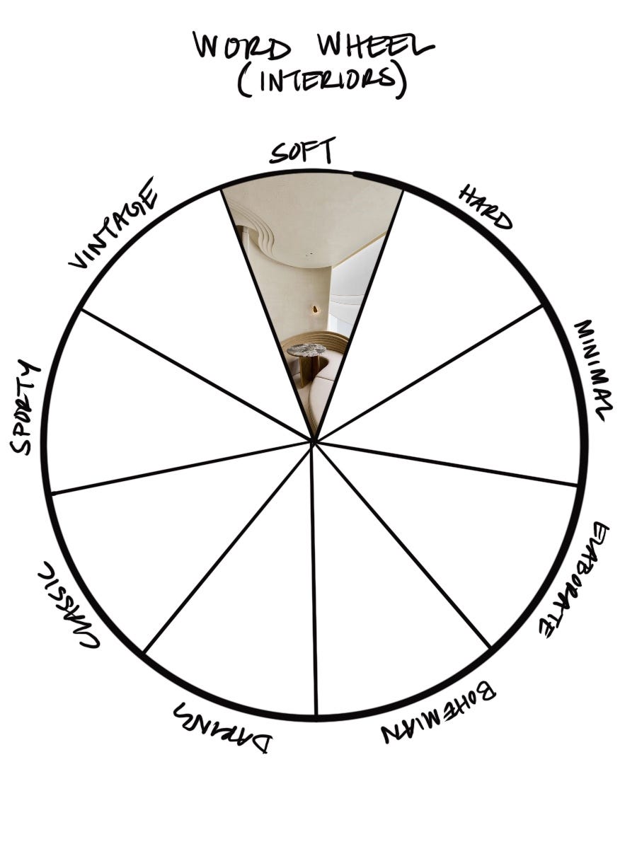
Last week I did a high-level analysis of the 3-word method for architecture. This week I will do a more detailed analysis for interiors, starting with the first category: “Soft”.
The main categories that I will describe in detail are light, color/pattern, materials, and furnishings, and how each of them bring softness to a room.
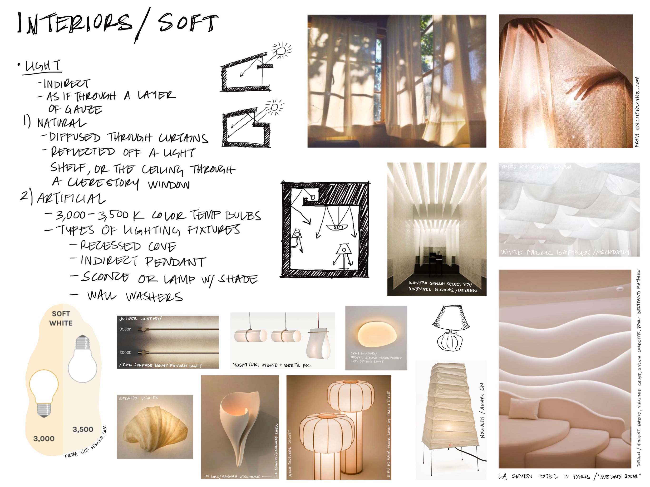
Light
I started with light because I think it is the most important category. The right lighting will create a filter for the whole room: in this case, a warm, cozy ambiance. This can be achieved by diffusing lighting to create an even glow.
Natural Light
The easiest way to diffuse natural light is through a layer of gauze - sheer, light-colored fabric, paper, or similar. Alternatively, light that is reflected off of a ceiling (as from a light shelf) or on a wall or floor (as through a clerestory window) will also scatter the rays, reduce glare, and create a more luminous character.
Artificial Light
Color
For artificial lighting, the right color temperature bulbs (approximately 3,000 - 3,500K for a natural soft, slightly yellowish light) will produce the most pleasing light.
Lighting Fixture Types
In addition, the same techniques for natural light are applied to diffuse artificial light - illuminating a surface (recessed cove lights illuminate walls and/or ceilings; indirect pendants illuminate ceilings; wall washes illuminate walls). A table lamp or sconce where the light source is hidden by a translucent material will also achieve this glow.
Colors
The color story for a “soft” room is based on two primary characteristics: muted colors and moderate-to-low contrast between them.
Colors: Soft Summer vs. Soft Autumn
The seasonal color analysis method is typically used for finding one’s colors for fashion and makeup, but I think these color palettes can also be used for interiors.

From the chart above, there are only two “soft” categories: soft summer and soft autumn. I explored these two categories below:
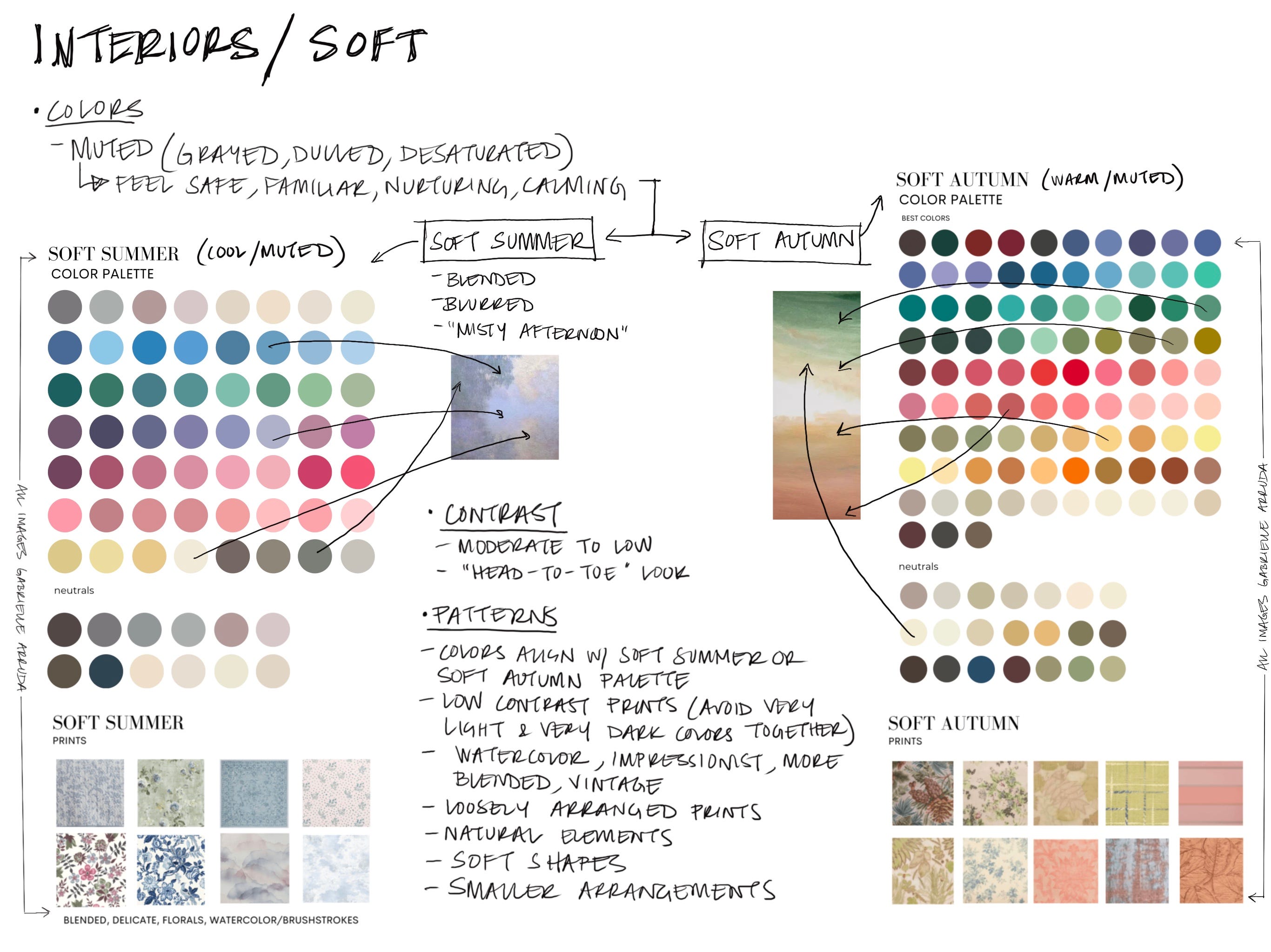
Both color palettes are made up of muted (grayed, dulled, desaturated) colors, but the main difference is the undertones - soft summer has cool undertones and soft autumn has warm undertones.
As I was putting these notes together, I realized that “soft” has to be one of my three words. Interestingly, I am a Soft Summer when it comes to my own coloring - my hair, skin, and eye colors are generally muted (neither bright nor intense), with medium saturation (neither vibrant/bold nor dull/washed out), and my hue leans cool (cool undertones with subtle warmth meaning I can wear either gold or silver jewelry). Basically, I’m neutral in all colors - light/medium brown hair, soft blue eyes, light skin with a pink quality. What’s interesting about this is that this is the exact color palette that I have chosen for my own home:

When I think of a Soft Autumn, I think of my mom - she has similar coloring to me but tans much better, and gold looks even better on her. The interesting thing about this is when I thought of the colors she picked for her house, it is solidly in the Soft Autumn color palette:

The colors are all warmer and more red than what I’m choosing. I love this living room so much I keep trying to emulate it in my own house - and yet, I just keep picking cooler colors…
So my new question is this: Do people pick their interior design colors intuitively based on their seasonal color analysis? I will be testing this theory.
Contrast
Other than color, the necessary characteristic that “soft” rooms have is a lack of contrast. This means that all of the colors run together when you squint at the whole. With nothing in particular standing out, the overall room has a blurred quality to it.
Patterns
Patterns that feel “soft” are those without bold, decisive outlines - watercolor, impressionist, blended patterns work best. The contrast of the colors in the pattern should be low, so that they almost run together. The prints will be made up of soft shapes in a loosely arranged style (avoiding rigidity). Often there will be natural elements in the pattern, helping transition the views from the outdoors in (blurring the line between the two). Arrangements are typically smaller in order to avoid large and overpowering motifs. The theme is blend, blend, blend.
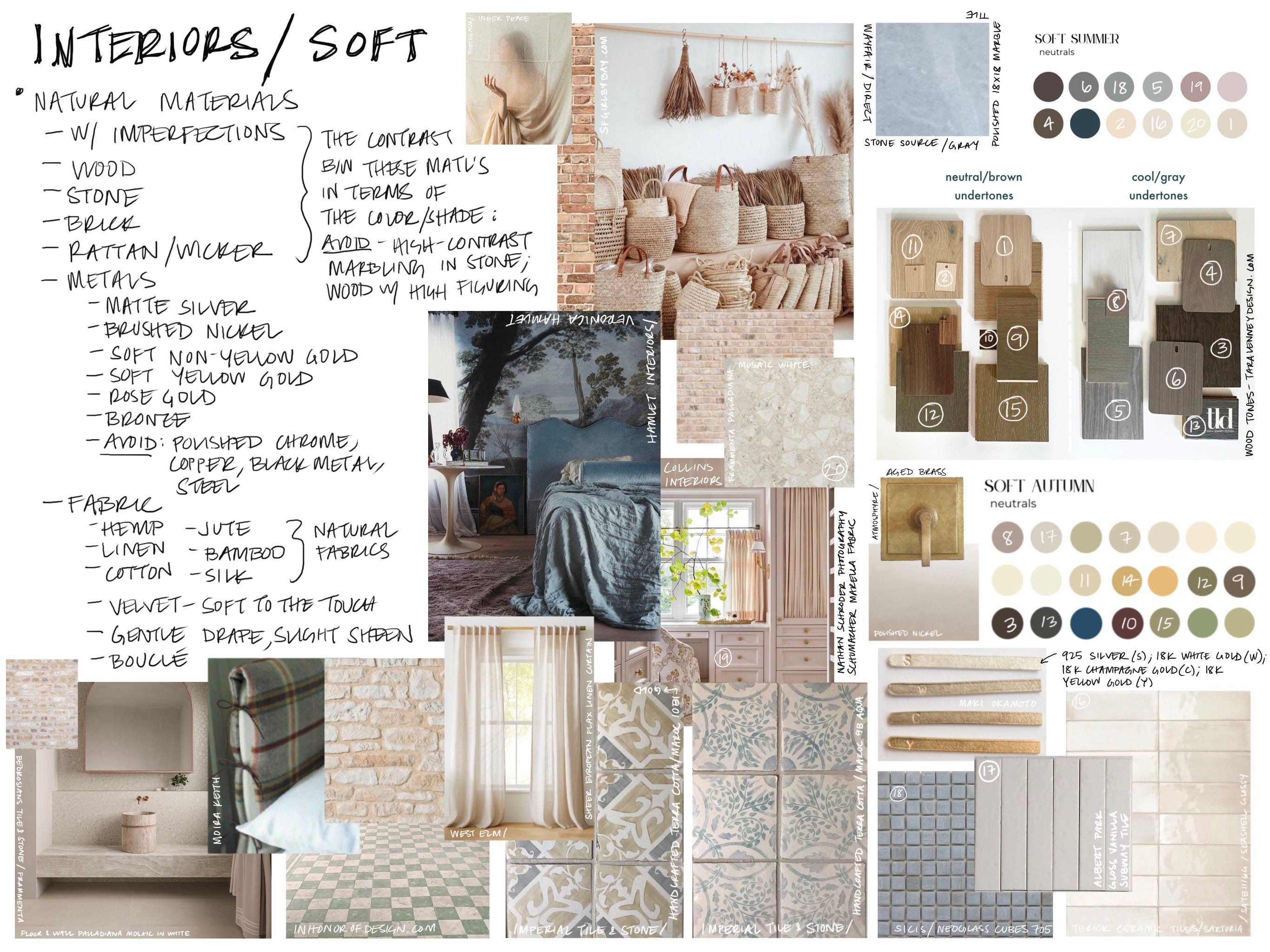
Materials
The materials that come to mind when I think of a “soft” room are primarily natural, and with an imperfect quality. Everything is in the “middle” - nothing is too matte or too shiny, the colors all run together, and there isn’t much contrast.
Wood
Wood colors have neutral/brown or cool/gray undertones, with their colors matching the neutrals found in the Soft Summer and Soft Autumn color palettes. Wood graining or other figuring is minimal (low contrast).
Stone
Stones come in colors from nature, and have little contrast in terms of veining or other variation.
Brick
Brick feels aged and in a neutral color.
Metals
The primary metals for a “soft” look are silver, white gold, champagne gold, soft yellow gold, nickel, or brass. Brushed or aged versions are preferred over polished. The metals to avoid are polished chrome, copper, and black metal (too shiny, too saturated, too high contrast, respectively).
Fabric
Natural and soft fabrics like cotton, linen, bamboo, and silk are great for this style. Velvet and boucle, although often synthetic, will also work due to their soft feel.
Other
Other natural materials that can be found in a “soft'“ home are “woven” types: rattan, wicker, and grasscloth (furniture, baskets, wallpaper, etc.).
Noise
Another thing to consider is sound absorption. Common building materials (gypsum board, wood, concrete, brick, tile) are reflective, meaning sound waves will bounce around the room for a time after they are created. Introducing soft, absorptive materials (such as furniture with thick cushions, carpet, or heavy curtains) will dampen this effect. This helps with conversations in the room - preventing the background muffling that can sometimes make it hard to hear - and add to the coziness of a space.
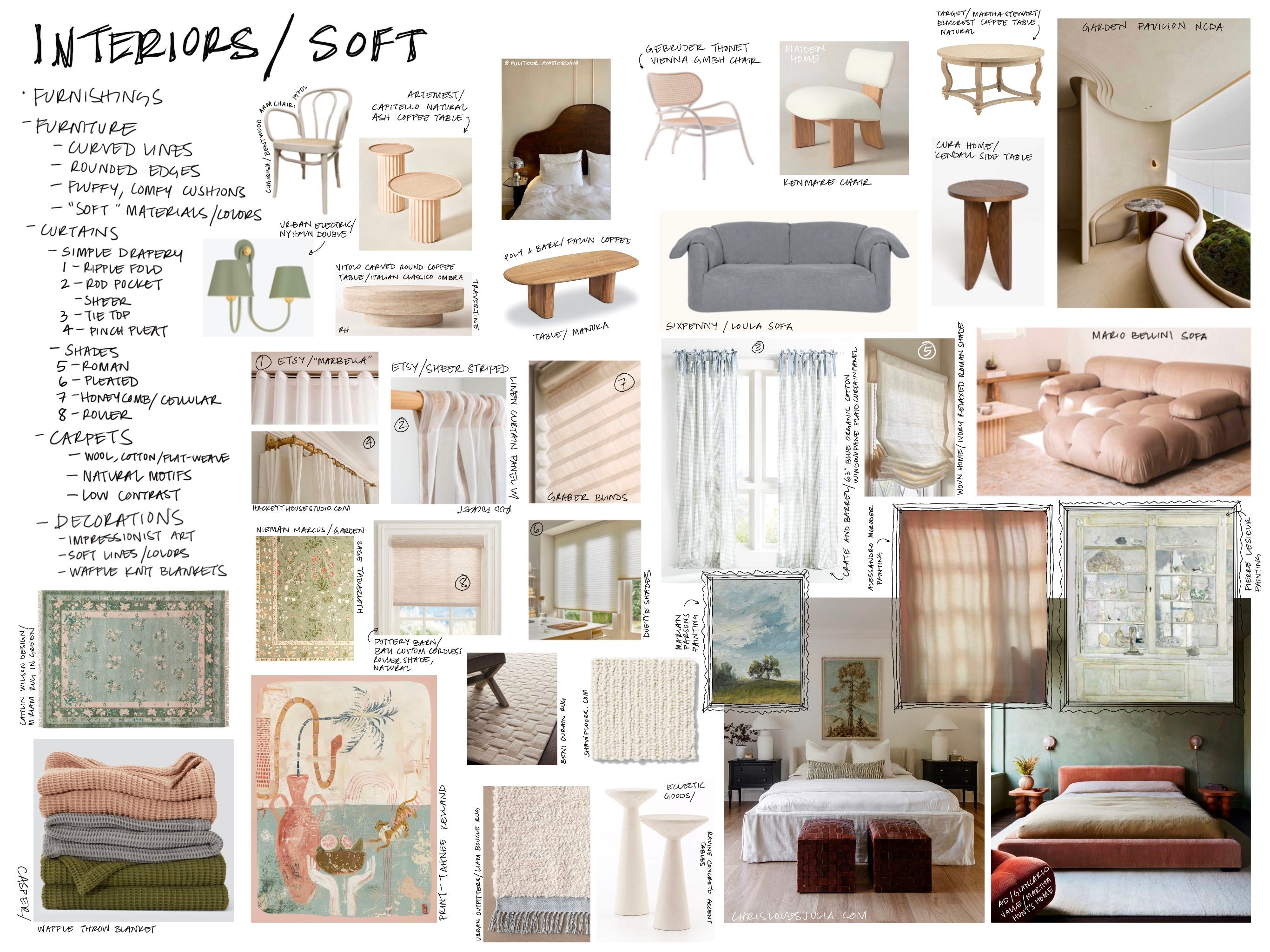
Furnishings
Furniture
Curved lines and rounded edges will be found in this style. Furniture will be made from natural materials in neutral colors from the above color palettes. Cushions will be fluffy and comfortable, allowing you to sink into them.
Curtains and Shades
I think that a simple, flowy look works best for the “soft” home. For curtain hanging methods, the ripple fold, rod pocket, tie top, and pinch pleat methods complement this style. For shades, roman, pleated, honeycomb/cellular, and roller types work well - they are neither too ornate nor too modern. A sheer quality to curtains and shades will filter sunlight in a soft manner into the space.
Carpets & Rugs
Flowers, greenery, and other natural motifs, as well as neutral, one-tone colored carpets and rugs achieve this look. Materials that are soft under the feet with neutral weave patterns will blend the rooms together to create a cohesive space.
Decorations
Other than muted colors, examples of styles of art in this category are watercolor, impressionist, and blended, with low contrast.
Vases and other decorative objects will have rounded qualities and will be made from tactile, natural materials.
Let me know if you have any other ideas about what makes up a “soft” room. Also, do you think your seasonal color chart matches how you have decorated your space? I’m very curious to know!
Happy Friday,
Anna